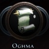
Edward, the entity formerly known as Kung or Kungfoowiz, has proved his mastery with painting programs! He made two versions, and Mags liked one more and I the other. So, as a compromise I made a swapper script showing one of them at random. Purple or black, it's both spiffy.
See no real difference to the pleasing eye though. Older looked better imho.
_________________ "Most assume that all the followers of Lathander are great morning people. They're very wrong." "I think we are the only group where AD&D stands for Attention Deficit Disorder."
Joined: 03 Jun 2007 Location: [st]Ultrinnan[/st] [st]Edonil[/st] Nec'perya
I had just made a topic about this in off topic, i thought it was new and shiny
_________________ Slander [Zanthair Akarupa of the Horsemen of the Apcalypse] - Sorcerer 'Mediocreare' Isendu't'tar Ussen'd'Vhid d'My'ana'd'Xull'd'Vharcan - possibly the longest name in Amia Tiffany Seagrass - weak and fragile weaver of words
The old one was ugly as hell. This one's quite nice. Can't really think of a fitting logo for an online role-playing server that isn't cheesy in some way, it comes with the job.
_________________
On Joon, Kjetta wrote:
The guy that probably has sexual fantasies about masturbation. I mean, Iron, you're a bookworm nerd that even in your wildest escapism fantasies flee to the internet to play the role of another bookworm nerd? Come on!
I must admit part of me wanted to steal the new icon and hide it with my other collections of shinies.
_________________ Dwagin [Duh-wa-GIN] N. - 1a. Small and cute thingum, particularly fond of four legged scaled creatures of the metalic and chromatic varieties.
Having seen both now, I prefer the black one on the black background. Would probably be different with a purple or white background, since I prefer purple overall.
_________________
On Joon, Kjetta wrote:
The guy that probably has sexual fantasies about masturbation. I mean, Iron, you're a bookworm nerd that even in your wildest escapism fantasies flee to the internet to play the role of another bookworm nerd? Come on!
Pretty please? More purple, Amia is into purple! =3
Oh, and nice work! I love the new logo fits much nicer then the old one.
Edit: after some ctrl + f5 spamming.
I like the purple one. Surprise.
_________________ Fear is not evil… It tells you what your weakness is. And once you know your weakness, you can become stronger as well as kinder. - Gildarts Clive, Fairy Tail, Hiro Mashima.
I like the black one better, too. The purple looks kinda weird, just thrown in as the only bit of purple on the entire page. It'd probably look better if there was more color overall to the forums themselves.
_________________
Login: The Copper Queen Cromlech - The Best Copper This Side of Ruathym Zelly Cys'dina - The Wounded Soul, Also Merchant Aelynthi Nor'alei - The Bubbly Winged Elf
wooo, I like the gold and purple. It doesn't look girly.. males like purple too, it looks shining!!! and it is good to be purple makes the name show more than the rest.
ummm, dont change the color of the forum, I like this one.
I liek Jean Ortega as a character because it shows that everyone can be different. I also don't think we should incorporate mean behavior in video games.
We also need to see all thre now side to side to compare them.
_________________ "Most assume that all the followers of Lathander are great morning people. They're very wrong." "I think we are the only group where AD&D stands for Attention Deficit Disorder."
As much as I love purple....and I do..named my child for a favorite purple stone....I think the black and gold with accents works better for the site.
Namely because there's no purple elsewhere to pick up and accentuate the colors. Now Black, gold and a darker gold mayyyyyybe.
_________________ GM "Roll a new sheet, you died for blasphemy." P1 "Was the comment he made that bad?" *dice roll for chart* GM "A Sun elf dry-humping the temple statue of Lloth during worship." P1 "...so new character you say?"
Joined: 10 Aug 2005 Location: Ottawa, Ontario, Canada
I dislike the gold part of the new logo design, personally.
I'd be much happier with a black and purple.
But if I have to choose between one of these two, I have to go with the black and gold. The purple and gold is too gaudy looking - it's the gold that does it.
_________________ Role with the Punches...
Elan: A 10% chance is pretty unlikely, but everyone knows that a one-in-a-million chance is a sure thing!
wooo, I like the gold and purple. It doesn't look girly.. males like purple too, it looks shining!!! and it is good to be purple makes the name show more than the rest.
ummm, dont change the color of the forum, I like this one.
Exactly! it's shinning with little stars, its gold and purple, its girly!
Make it pink to complete it realy well.
As the previous was net, was hm, how to say it in english... classy and sobre. Was representing well the atmosphere of DnD.
This is too materialistic for me
(Oh and by reading posts, it seems more girls like it than males)
EDIT: no offense to you fellows of the higher sex gender.
Hm. I never noticed it because I just log in to www.amiaworld.net/phpBB2 and so never see the sidebar.
I like the purple except for the way it looks in the initial letter "A", so overall I have to go for the gold and black one.
No poll? (not that it would mean anything).
_________________ ~Sharess on AmiaWiki~ Priestess, politician, prostitute "[They] were moving in on me like Sharessans on a new broad in the bath house" - Tracer Bolt AmiaWiki mod (mostly inactive)
I like the fourms how they are! The color is easy for my eyes to read and it dosnt make me cry and or get head aches like black on white would, likly.
Though if you do want to change the fourms, Nehky, please make it so we can pick from a set of like 5 options for colors. That way people can have their different, and others can have their same.
Joined: 06 Jan 2008 Location: ANU, behind the coffee mug (+10 GMT)
Terra_777 wrote:
Nekhy wrote:
Can we redo the website while we're at it?
*Big, moist puppy eyes*
Pretty please? More purple, Amia is into purple! =3
Oh, and nice work! I love the new logo fits much nicer then the old one. :D
Edit: after some ctrl + f5 spamming.
I like the purple one. Surprise.
Oohs purple. The new logo was the first thing I saw when I opened amiaworld.net ... but it doesn't really fit in with the colour scheme of everything else, so there is only one logical option ....
Predictably, change everything else.
_________________ 2009's Second Most Overall Contributing Player
Joined: 06 Jan 2008 Location: ANU, behind the coffee mug (+10 GMT)
o0GuNz_N_RoSeZ0o wrote:
Black and Gold looks very nice. The Purple and Gold would need some site design update for it to not be all mismatchy and odd looking.
Purple and black are a nice combination, but not if you're trying to read it. Purple, black and gold are an awesome combo, provided you have someone who knows what they are doing.
_________________ 2009's Second Most Overall Contributing Player
Users browsing this forum: No registered users and 117 guests
You cannot post new topics in this forum You cannot reply to topics in this forum You cannot edit your posts in this forum You cannot delete your posts in this forum

 FAQ
FAQ
 Search
 Login
Login


 This thing looks really really cool, I love it.
 (
(